Ranking The Best AND Worst NHL Reverse Retro Jerseys
The every-two-year money grab marketing campaign from the NHL is back! Its the 2022 reverse retro jerseys, just in time for Christmas, and causing hot debate!
Your opinion on these stylized third-jerseys will vary depending on team biases, colour scheme, & what your hated rivals have.
For me, its not so much about which ones are good, as much as it is which ones are bad. (Most of them are bad.)
So, I thought I’d present my top 3 WORST reverse retro jerseys, and if you can stomach it, then I’ll share my fave three!
The Worst of the Worst
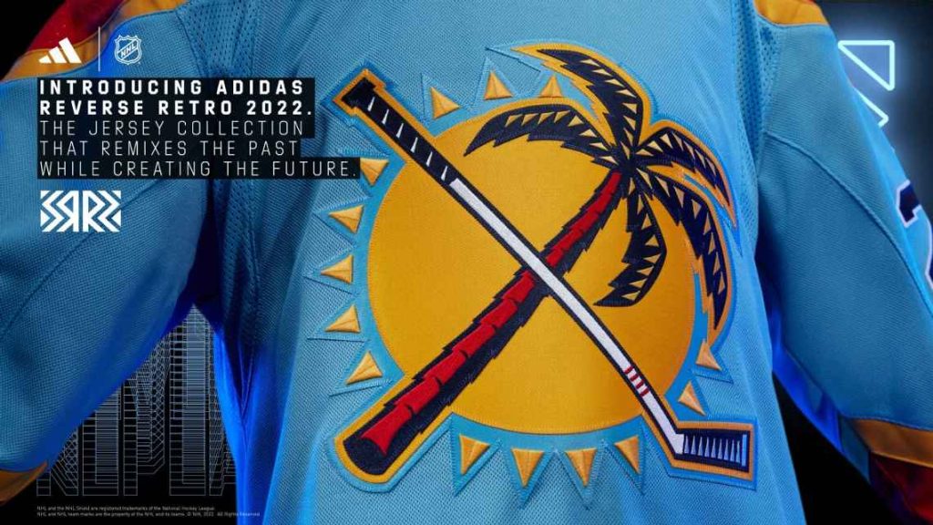
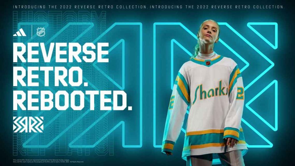
What is this? I understand the traditional, tight team logos is what they want to steer away from, but I thought that was a golf club at first glance. This looks like the logo of a (bad) golf resort.
2nd Worst
Talk about mailing it in! The colours don’t mean anything to the team and that font looks like one of the lesser-used options in instagram stories. Replace that k with a t, and you get my true opinion.
A Tie Of Sucktitude
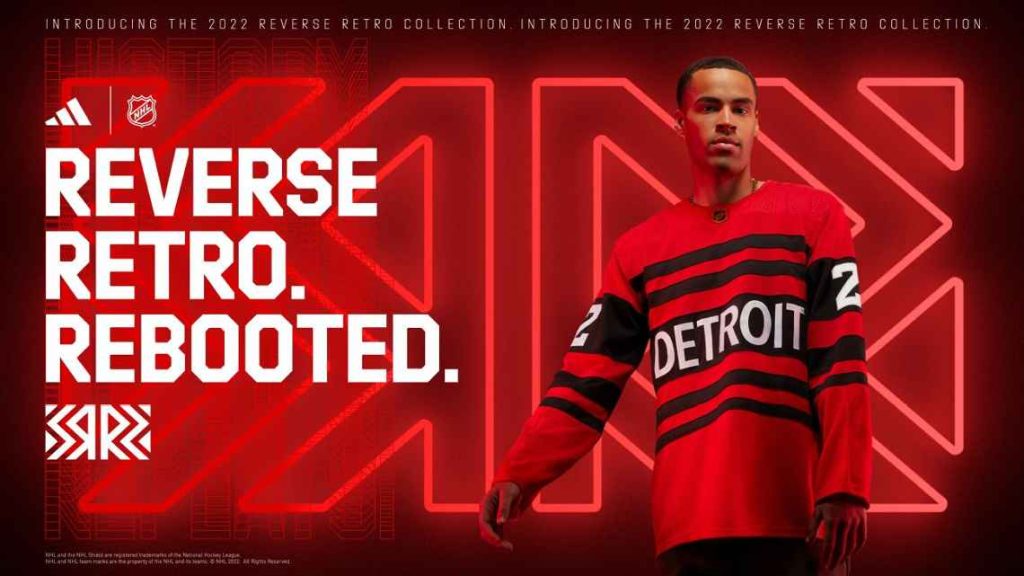
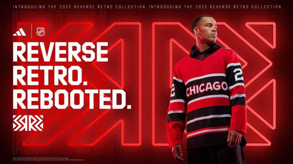
Talk about lazy. Or bad communication. Or both. In a vacuum, these jerseys aren’t the worst. Imagine that Detroit sweater as a Raptors b-ball jersey & I’m all in. But lets pray these two teams never play each other on reverse retro night!
Honourable Mention
On the surface, it’s not terrible. But the lines at the bottom look like my 9 year old trying to colour within the lines before being distracted by ice cream and smudging her line up the page.
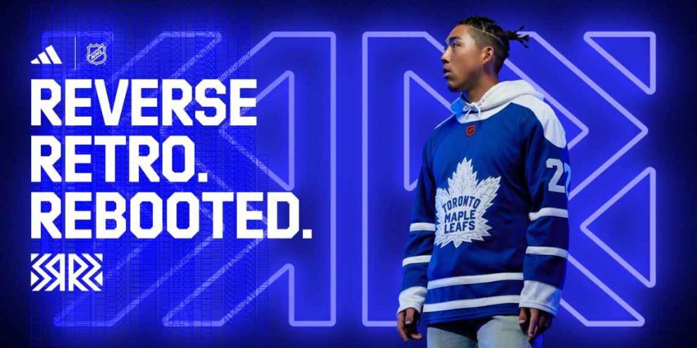
Moving on…they’re not ALL bad…here’s my picks for the top 3 BEST. (The Toronto jersey doesn’t rank because I see no discernible difference between it & their usual.)
The Best (No Bias)
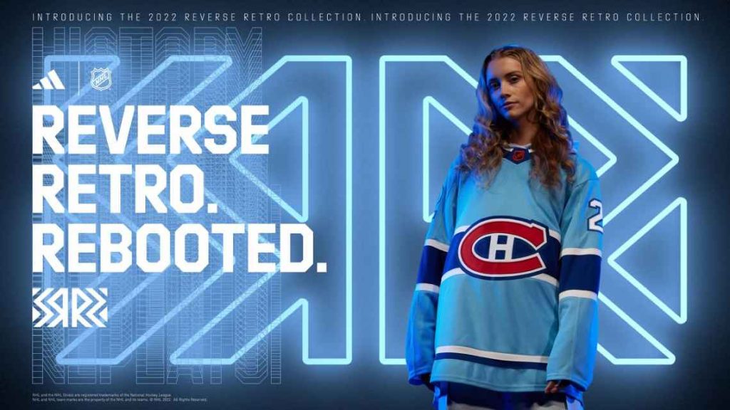
Maybe it’s the model, maybe it’s the colour, but that just looks cool. I wouldn’t buy one myself but i would take one for Christmas…hint hint…
Runner Up (Maybe The Actual Best)
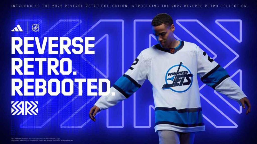
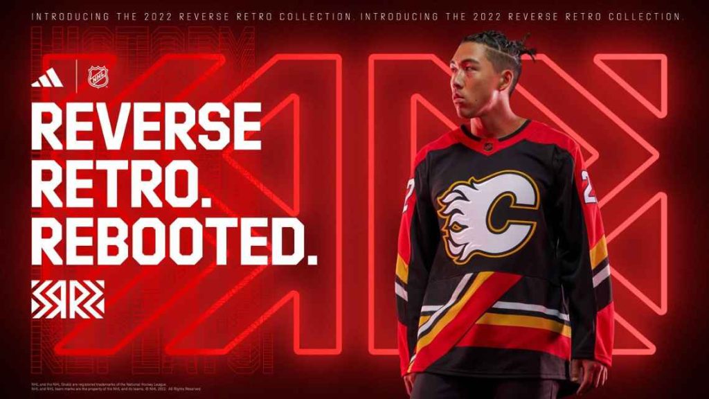
Classic logo, cool colour scheme, and slick black accents. Boom. Love it.
Third Best
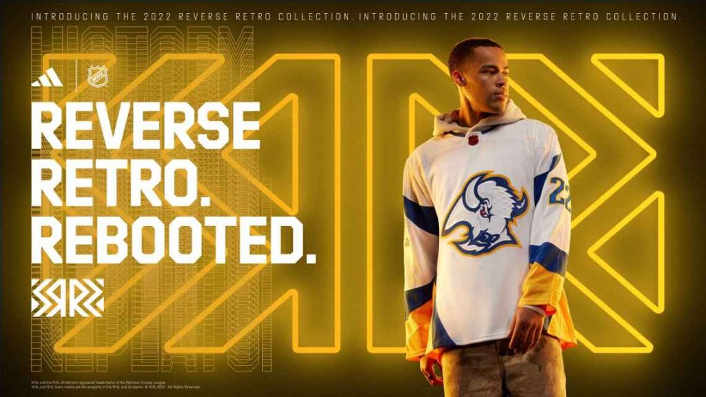
Big logo that fits proportionally, plus I love the arm & bottom stripes/accents. Cool colours too.
Honourable Mention
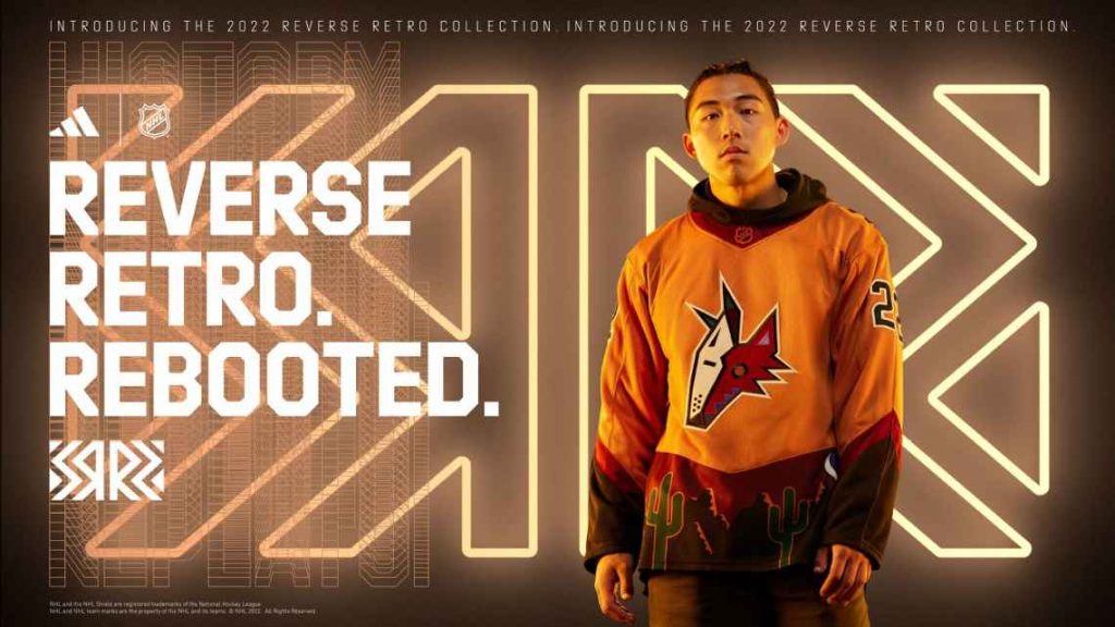
This is a piece of art. It tells a story. It would be at the top of the list if you wandered into the dessert and took a high dose of mushrooms.
What do YOU think? Check out the rest of the NHL 2022 reverse retro jerseys here.
McCully
Snag Our Newsletter
Hit that button like you’re pressing play on your favourite track. get exclusive content, stories, and news.
Related


Upcoming Concerts